*** I had the privilege to attend a class by Ryan Church a while back. The tutorial below is his painting process and what I'd learn from the class.***
1) Start with a small resolution canvas of 1000 pixel or less (Length or Width).
2) Kill the scary white canvas by flooding it with a neutral gray and scribble random marks to loosen up.
3) Start blocking in the dominant shape of light and shadow using the Painter 6 watercolor and the square chalk brush. Don't worry too much about details. This is early stage is the most enjoyable part of painting for me. Allow yourself to make happy accidents. Try not to be so sure of what you are trying to paint and let the random marks suggest to you.
4) During this initial process, don't zoom in too close that you can't see the whole image. This will force you not to noodle the details. Also use the Effect > Orientation > Flip Horizontal to get a fresh view of your image. I actually make an F5 function key for Flip Horizontal because I use it so often.

5) Pick a dominant light source
6) Block in the dark shape by visualizing all forms as basic cylinders, cube and sphere. Allow the dark shapes of different objects to group together.
7) Bring up the light by first making a new layer, airbrush the light color (orange/yellow) using a large brush. "Carve" out the light shape by erasing the "airbrush layer" to reveal the underneath value then flatten to one layer again. This process is better ( subtle light gradation) and faster than trying to paint the light area carefully against the shadow shapes on a single layer.

8) Doodle in the city lights, keep perspective in mind to show the buildings form. Try to place them in a way that help bring the foregrounds elements forward. EX: placing the light around the girl silhouette to separate her from the buildings. I can already see how the city lights are a problem to this piece, they are too busy as graphic patterns. I'll fix that later in the process.
9) At this point, it's just about breaking basic form into smaller pieces of basic forms. ***Don't try to force what you know in what you are trying to paint. A hand doesn't need all FIVE fingers to be a hand. Let the viewer fill in what you leave out. Suggestion is always more expressive than display because it allow the viewer to see what he/she wants to see.
10) I want to have a shiny red car parked behind the balcony. Its going to be tough to separate that from the city lights and the foreground elements. It's fun to test yourself :)

*** Enlarge the canvas to a bigger size at this stage (2500 pixel is usually the longest or widest I go)
11) Bring out the dominant warm light even further. Use a finer brush to indicate the corner where the forms turn
***refrain yourself from zooming in***
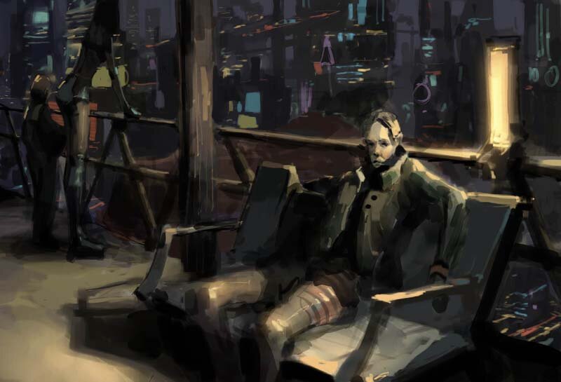
12) For the boy and the girl, add a cool bounce light to bring out their forms( her butt and his shoulder).
13) Make sure to use Flip Horizontal often!!! I'm beginning to see my perspective problem...as if I don't have enough things to worry about >:(

14) I need to separate the boy and girl silhouette even further so I added more city lights around them. Add a yellow "kicker" edge light to emphasize their shapes even more. Also, darken the girl upper body completely, this will reinforce her silhouette against the horizontal band of city lights.
15) The man jacket needs to be darken since its facing away from the tube light.
16) And yes :( ...that damn shiny red car is still mud.
17) Make a new layer to start on the car. Loosely paint the details, then erase out where the strokes overlap the foreground elements, then flatten to one layer again.
What makes this car read? A) cool blue kicker light on the left side to separate from the dark city. B) cutting lines that reinforce perspective. C) strong red highlight on the surface planes that face the tube light D) the subtle smoke help separates the car from the foreground (I know it's a cheat but it works :)
18) By adding some cable lines, I get a bit more depth.

18) It's time for texture! Use the watercolor brush to to glaze transparent layers of semi-compliment colors. EX: orange on green.
19) Smudge tool is great for softening the city lights to show atmosphere.
20) Add some more city lights on the left front of the car to help separate the space a bit more.
21) Fix the perspective of the rail and the chair
22) Cool kicker light on the left side of the pole
22) I needed something to fill the bottom left corner space to help balance the composition. It was an intuitive feeling but I can try to bullshit some meaning for you >> the whole dark mass on the [man/chair/chair shadow] is like an arrow pointing left out of the composition (squint your eyes to see clearer) which I don't want to happen so I added the "sweeper bot" to come in and block that visual escape. Its very Feng Shui...now I'm really bullshitting...hehehe
23) Save the image as a TIFF and import it to Photoshop for some Level adjustment. You can tell its a bit more contrast than the last step.


24) It's near completion so I edit the final stage in Photoshop. The Level adjustment from the last step cause the color to be very saturated so I tone that down a bit.
25) The background city lights is still very busy so I need to fix that.
Here are the steps: Make a new layer, Get a large low opacity /hard edge brush and choose the sky color. Glaze over every part of city to push it all back into the distance. Erase out some of the edges that overlap with the foreground, then flatten to one layer.
26) And its done!!! There is still plenty of room of revision but I have really short attention span and I rarely ever go back and fix my old paintings. A painting like this can take me between 7-10 hours. Don't worry about speed, that will just come with repetition. Its better to do it right than do it fast. Though it seems that there is too much analytical thinking involve (which is true), but if you done it enough time, most of the process will come out intuitively.
I'm really sorry for my horrible grammar. I hope this tutorial is clear enough to help out those who are curious about my train of thoughts as I paint. If anything is unclear, me and I'll try to revise it.
